Responsive Web Design Test
How To Quickly Test If Your Site Is Responsive to Desktops, Tablets, and Phones
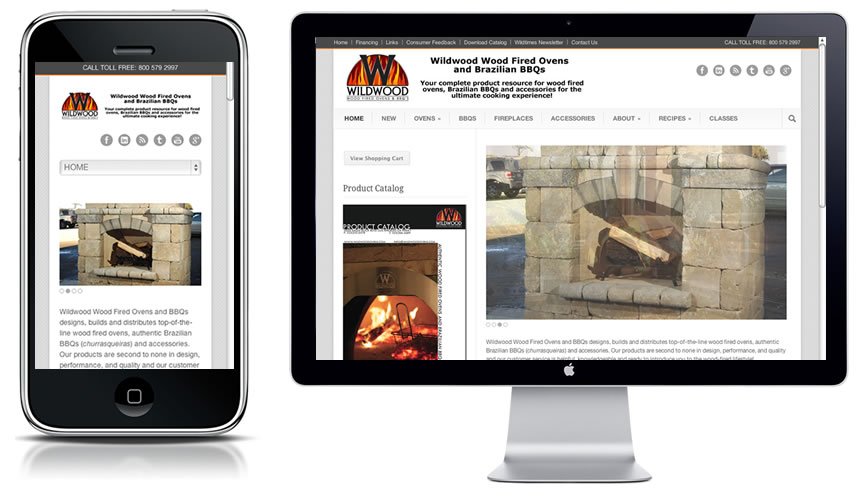
A carefully selected WordPress theme has a responsive website design. If you select the proper theme (ie. a responsive theme) the site will collapse and rearrange itself as the screen gets smaller as shown here. The site that looks good on a desktop, will rearrange itself on a tablet, and rearrange itself further on an iphone:
This capability of having elements slide around for optimum phone viewing is critical. Rearranging elements to accommodate different devices is done by CSS. The programming behind doing this is complicated. However, on a properly selected WordPress theme handles this automatically. As a designer you don’t have to worry about it. The programming details are handled. It’s a good thing because pulling this off would take weeks of tedious programming.
When a site rearranges itself for a phone, it’s not just making the site smaller. Getting smaller is what the majority of site do. When you view a traditionally designed site on an Iphone for example, it just scales down to the screen size, making the text too small to read.
This is a negative viewing experience for the user. They have to “blow up” portions of the site just to read it. The site is almost impossible to navigate. By contrast a WordPress phone compatible site doesn’t just shrink, it rearranges itself. For example, the logo floats to the top. The main menu turns into a drop down list perfect for navigation on the phone. The text remains as large as possible by putting content into a single column and displaying it as widely as possible. A properly designed site looks great on a desktop, great on a tablet, and great on a phone. It’s like three distinct designs each formatted specifically for the target device.
Just because the site was created in WordPress does not mean it is phone compatible. All sites display on a phone but few of them (less than one percent) look good. If having your site display on a phone is important, make sure you select a phone compatible theme before you start. Not all of them are.
The nice thing about these CSS phone compatible themes is they eliminate the need for a phone app. Companies often develop a second site, or an app, specifically for phones. A properly selected theme enables your site to serve a dual purpose: a traditional desktop site and a phone app style phone site. It gives you the best of both worlds and exposes your company to the largest possible viewing audience.
There is a specific test you can perform that guarantees you have a phone compatible site. Here is what to do:
- Display the site on your desktop.
- Set the width of the browser to slightly less than full width. In other words, do not display the site full screen. Make it slightly smaller than the screen (so you can see some desktop around the browser window).
- Grab the lower right corner of the browser window with your mouse.
- Hold the mouse button down as you drag the lower right corner of the browser window to the left. In other words, make the window smaller by dragging the right edge of the browser window toward the left edge.
- As you drag the right edge in, making the window more narrow, observe what happens to the content.
- Drag the right corner as far to the left as you can. It should stop about three inches from the left edge. At this point the browser window should be a narrow strip about three inches wide.
With the browser window narrowed to minimum width, this is what phone users will see. It the site looks good (with a pleasing layout) you have a phone compatible site. If it doesn’t look good (you have content falling off the right edge) you do not have a phone compatible site.
Phones are a wide viewing audience. While phones may never replace desktops, for most businesses having an attractive, easily navigated site on a phone is important. As long as you’re developing a site for the web anyway, it only makes sense to develop with iPhone website compatibility too. A dynamic, CSS web site looks great on both platforms. The smart play is to address your phone requirements as well as your desktop requirements.

